Page Layout
Although possibly not technically challenging for software developers, there are design differences in some complex scripts of which the typesetter must be aware. Many design issues are related to readability. The author and graphic designer, of course, want to have their manuscripts read. Emphasis, cultural design issues, optimum line length for a particular typeface and point size, leading, kerning and word spacing are all important in contributing to readability and will be different for each writing system.
Page size and margins
Section titled “Page size and margins”There are some simple differences in the setup of a page. For instance, most of the world outside of the United States uses A4 paper.
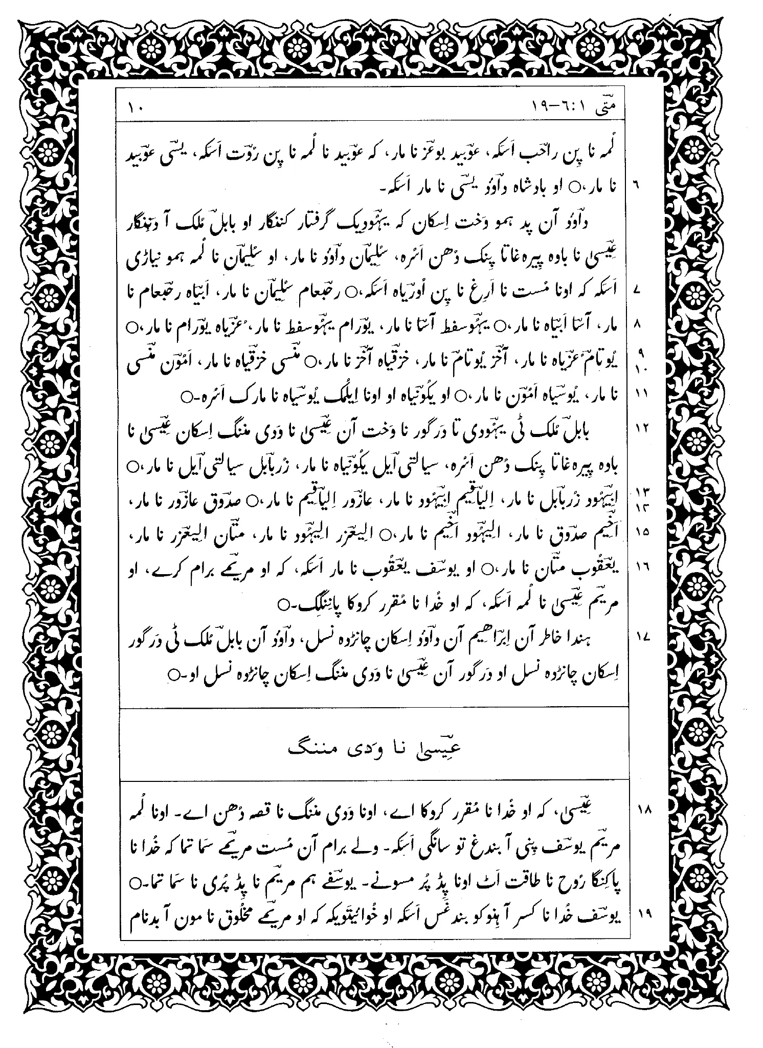
The setup of a page will especially be affected in RTL and top-to-bottom books. Even numbered page numbers will now be on the right side of the page and odd numbered page numbers on the left side of the page, as seen in Figure 1 (page numbers are on lower outside margin) and Figure 2. Thus, even/odd pages will have margins which are opposite from a LTR book.

With sacred writings, especially in RTL scripts, one often needs to add decorative borders around each page (see Figure 1).
Headers and Footers
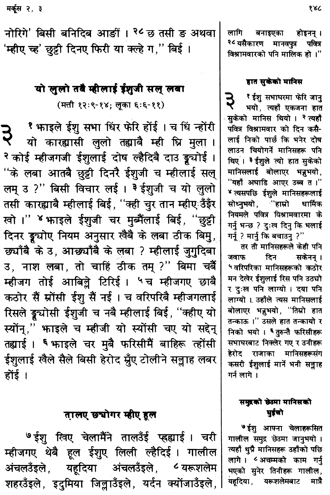
Section titled “Headers and Footers”Many books use a line under the running header to set it off from the text, as seen in Figure 2.
Another issue that needs to be examined is what headers, footers and footnotes look like with vertical text. Do they run across the top and bottom of the page or do they run down the far left or far right of the page? The publishing application must be able to handle these unusual header and footer types.

A vertical text with vertical headers is seen in Figure 1 while the body of Figure 3 is vertical with vertical footnotes but has LTR horizontal headers and footers. Examples of Chinese and Korean with RTL horizontal headers have also been seen.

Figure 4 has a vertical body text with both a horizontal header for the page number and a vertical header on the outside pages (which contain first and last dictionary entries). Figure 5 has a vertical body text with a header across the top of the page while the words in the header are still running vertically LTR. What a rich variety of possibilities!

Columns
Section titled “Columns”Columns, of course, must be handled differently when a vertical script is in use. Figure 5 shows a dictionary which is set in three columns. The text reads LTR, then flows to the next column and again begins at the left and flows right. Obviously, column behavior for RTL vertical scripts would be opposite to this.
Multilingual texts and diglots
Section titled “Multilingual texts and diglots”When mixing scripts on a page it is important to ensure that the body size and feel of the fonts are balanced. If one font is significantly heavier than the other, the page will look unbalanced.
There are differences in optimum point sizes between scripts. In some cases the point size needs to be larger to successfully reproduce complex characters or because of longer ascenders and descenders. The technical limitations that led to these point size differences are no longer a restriction, however, well-established point size expectations remain. Clearly this affects line spacing as well and, in many computer applications, one would not want to allow the default leading to prevail.
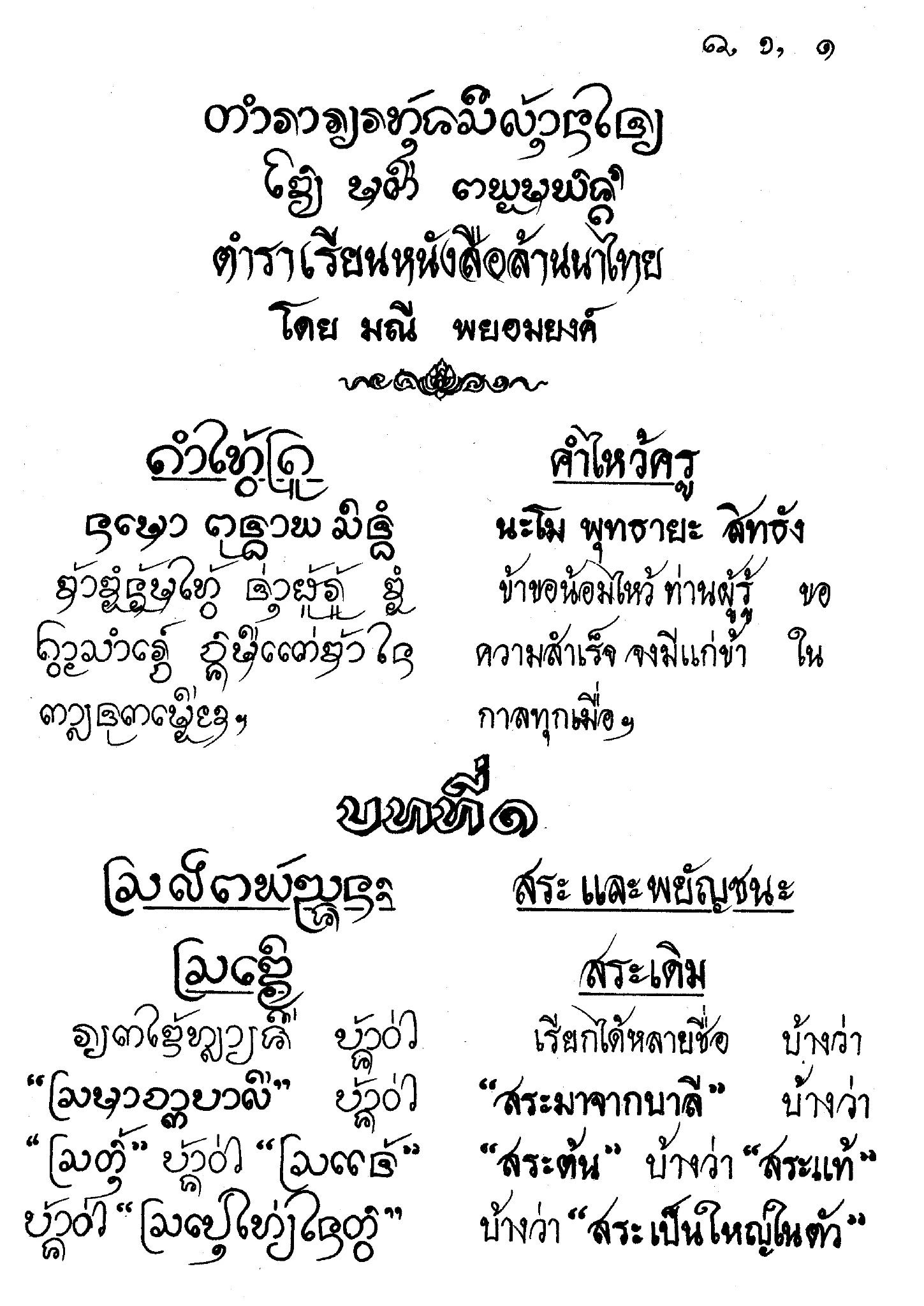
The result of having larger point sizes and greater amounts of leading means that the size of the finished document can increase dramatically. For example, one edition of the Thai Bible has only 24 lines of text per page, and weighs in at 2.2 kg!
Diglots
Section titled “Diglots”The ability to typeset diglots is also important. This could take the form of using the same script (Figure 6) or two differing scripts (Figure 7).
Illustrations
Section titled “Illustrations”Placement of illustrations need to reflect the natural reading flow. Studies show that in reading Latin script pages, the eye naturally scans from the top left to bottom right, and graphic designers keep the normal eye flow in mind when they are designing pages. Further study is needed to know whether there are similar guidelines for placing illustrations with RTL and vertical scripts.
Titles and typefaces
Section titled “Titles and typefaces”It is common to use a large variety of fonts for titles. Latin script stylistic variations, such as serif fonts, all caps, bold, and especially italic do not always lend themselves to other scripts. Other methods of highlighting information, creating contrasts and emphasis are needed. The method used will vary greatly depending on the script.
One would also need to study whether certain typefaces are only used with specific types of literature (for example, used only when talking about certain events), or whether they can be used anywhere. It would be important to know whether certain fonts (such as more ornate fonts) would be used in sacred writings, in newspapers, novels, etc.

Figures
Section titled “Figures”- Yü, Ta-fu. Chung-kuo hsin wen i ta hsi, Vol. 2, pp. 534-535. Taipei, Ta han chu pan she, Tsung ching hsiao yuan liu chu pan she, min kuo 65- [1976- ].
- .1998. The New Testament in Brahui, First Edition, p. 10. Lahore: Pakistan Bible Society.
- Ebisawa, Arimichi. 1981. Nihon no Seisho (The Japanese Bible: A History), pp. 260-261. Tokyo: Nihon Kirisuto Kyodan Shuppankyoku.
- Hasbaatar Saranbat. 1985. Baigal gazar zuin toli (Nature dictionary), pp. 2-3. Inner Mongolia: Inner Mongolian People’s Publication Committee.
- Tong, Qing-funei (Mr.). Chief editor. 1994. fon koolingga sibe shu tacin gisun i buleku bithe (Modern Standardized Xibo Written Language Dictionary). Edited by “Xinjiang Uygur Autonomous Region Working Committee of National Languages and Writings”, p. 400. Urumqi, People’s Republic of China: Xinjiang People’s Publishing House.
- .1982. Gurung-Nepali (common language version) New Testament, p. 148. New Delhi, India: World Home Bible League. Printed at Ambassador Press.
- Phayomyong, Manee. 2533 (Buddhist calendar). Learning to Read Lanna Thai (translation), p. 1. Chiang Mai, Thailand: Chiang Mai University. Printed by Sap Karn Pim.
- 7 May 1993. Dallas Chinese Times. D:8.
Portions of this content first appeared in Implementing Writing Systems , copyright © 2001 SIL International.